Scatter plots ↗
noOriginal Documentation
Documentation Index#
Fetch the complete documentation index at: https://docs.wandb.ai/llms.txt Use this file to discover all available pages before exploring further.
This page shows how to use scatter plots in W&B.
Use case#
Use scatter plots to compare multiple runs and visualize the performance of an experiment:
- Plot lines for minimum, maximum, and average values.
- Customize metadata tooltips.
- Control point colors.
- Adjust axis ranges.
- Use a log scale for the axes.
Example#
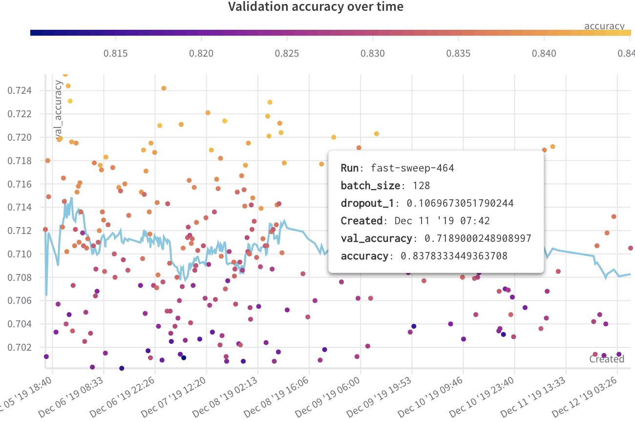
The following example shows a scatter plot displaying validation accuracy for different models over several weeks of experimentation. The tooltip includes batch size, dropout, and axis values. A line also shows the running average of validation accuracy.
Create a scatter plot#
To create a scatter plot in the W&B UI:
- Navigate to the Workspaces tab.
- In the Charts panel, click the action menu
.... - From the pop-up menu, select Add panels.
- In the Add panels menu, select Scatter plot.
- Set the
xandyaxes to plot the data you want to view. Optionally, set maximum and minimum ranges for your axes or add azaxis. - Click Apply to create the scatter plot.
- View the new scatter plot in the Charts panel.
Link last verified
June 7, 2026.
View original ↗
Source: Weights & Biases Docs
Link last verified: 2026-03-04